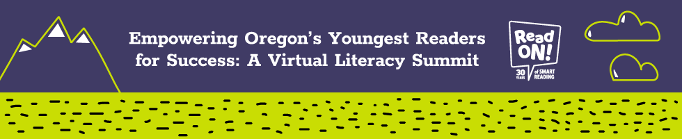
SMART Reading is a non-profit organization dedicated to encouraging more confident and enthusiastic readers. For their literary summit celebrating 30 years, I created a series of web banners for SMART’s website. The criteria was to be eye-catching, playful, and adhere to SMART’s brand aesthetics.
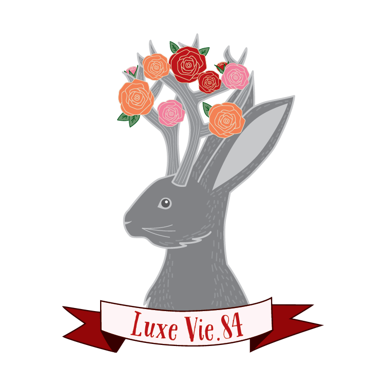
Luxe Vie.84, a start up clothing boutique, needed to develop branding for their online store and eventual store front. Luxe Vie.84 is a combination of "luxurious life" and the entrepreneur's birth year. To achieve a feeling of luxury, an elegant jackalope takes the forefront with a classy yet lively typeface. The coloring is specifically placed to frame the mysterious creature and create a sense of general intrigue.
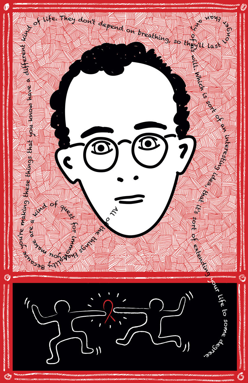
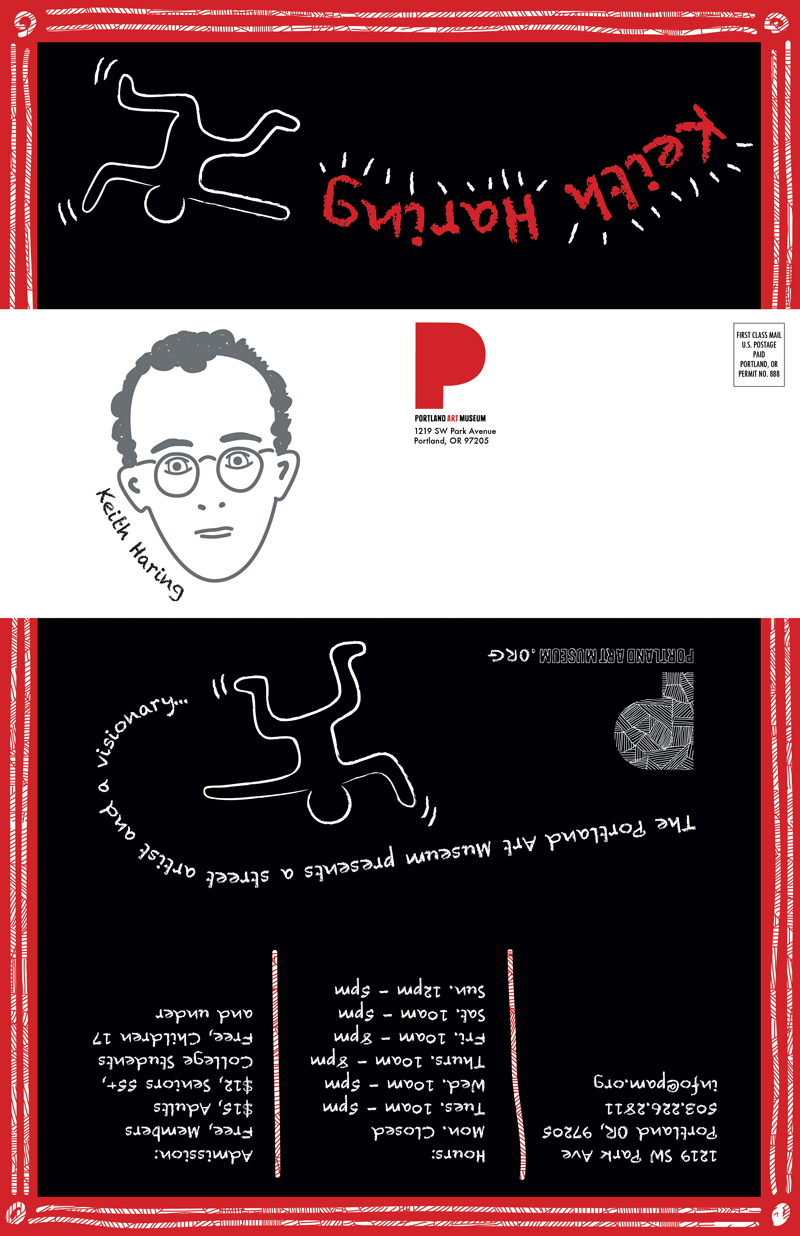
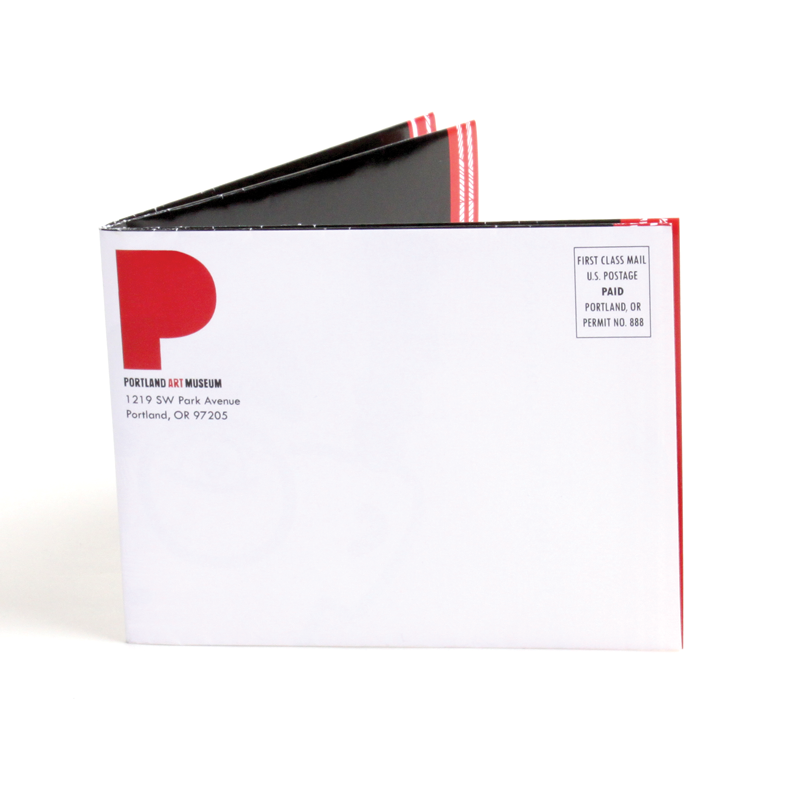
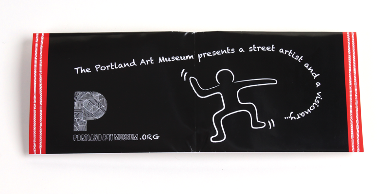
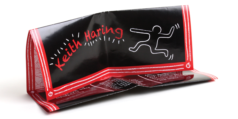
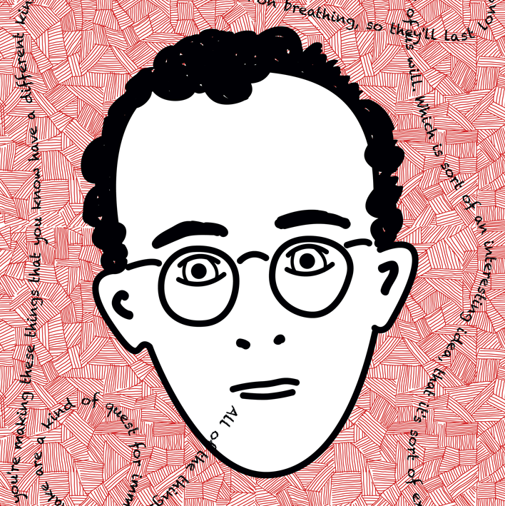
The Portland Art Museum wants to create awareness for an upcoming exhibit for street artist Keith Haring. By designing through interpretation of Haring's artistic style of whimsical movement, the audience becomes aware of the artwork he produced.
This is a fictional portfolio piece inspired by the designer.
11" x 17 (flat) | 5.5" x 4.25" (folded)
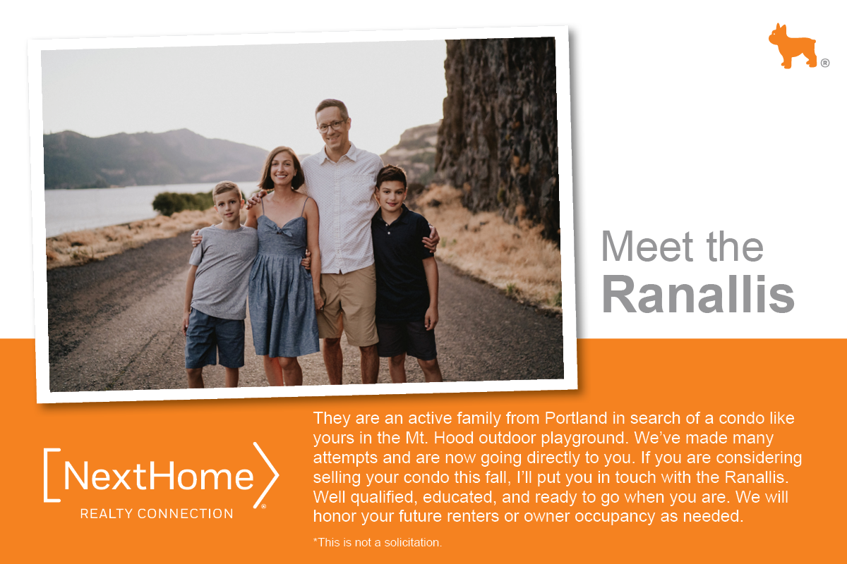
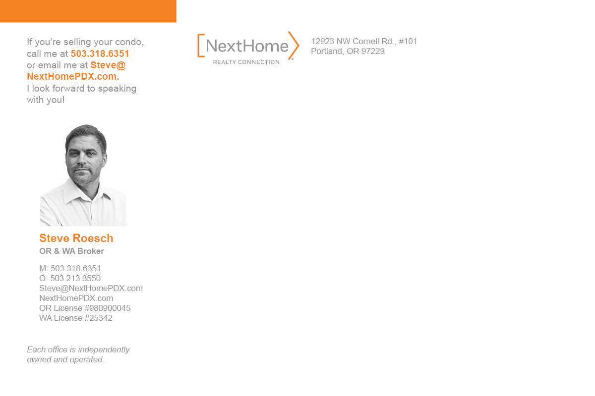
Steve Roesch of NextHome Realty Connection had a client, the Ranallis, that he was trying to find a home for. Part of real estate is “farming” or searching for clients by targeting a specific market. Thus, I created an eye-catching postcard, within NextHome’s brand guidelines, that would appeal to the area that we had targeted. This campaign was a success and the Ranallis now have a new place to call home.
Front of postcard
Back of postcard
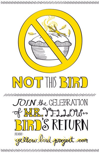
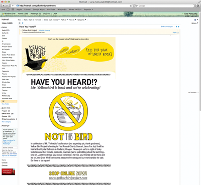
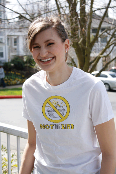
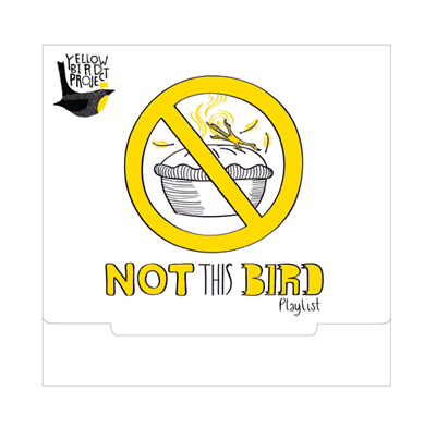
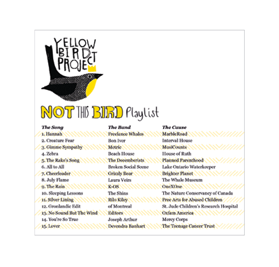
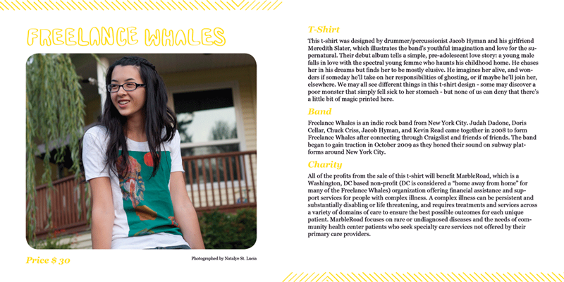
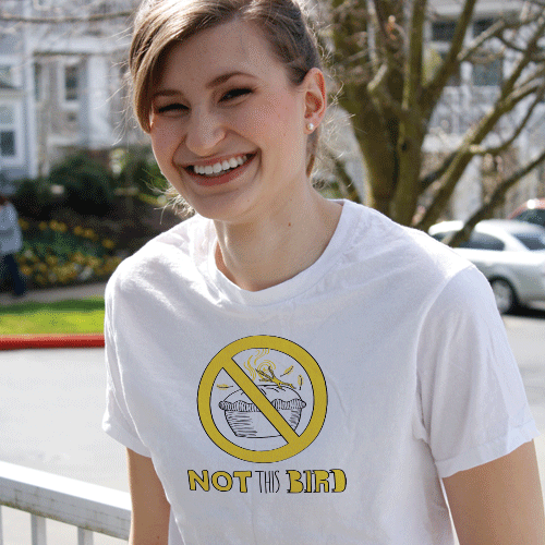
Yellow Bird Project is a Montreal-based non-profit organization. They work closely with indie rock musicians to create one-of-a-kind T-shirt designs that benefit an array of charities, each chosen by the musicians. To gain recognition among the Portland community, a charity concert is being hosted to celebrate the conclusion of their last campaign, Save the Bird. Branding and collateral is needed to reflect the easy-going nature of the company with the hope to get the community involved.
This is a fictional portfolio piece based on a real campaign, inspired by the designer.
11" x 17" Poster
Email newsletter
Demo album front, 5.125" x 5"
Demo album back, 5.125" x 5"
Inside spread of YBP Catalog, 5.5" x 5.5" (folded)
Photograph by Natalye St. Lucia
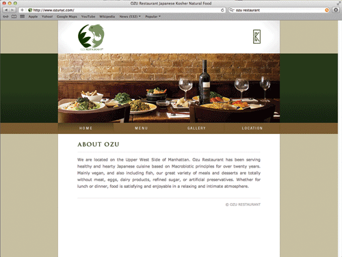
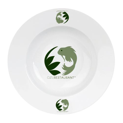
Ozu, a mainly vegan Japanese restaurant in Manhattan is under new ownership. The new owners want to update the current logo to better reflect the restaurant atmosphere and cuisine. The update should display the restaurant as Japanese, Kosher and natural.
This is a fictional portfolio piece inspired by the designer.
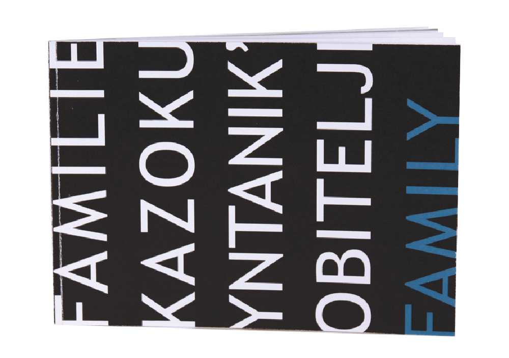
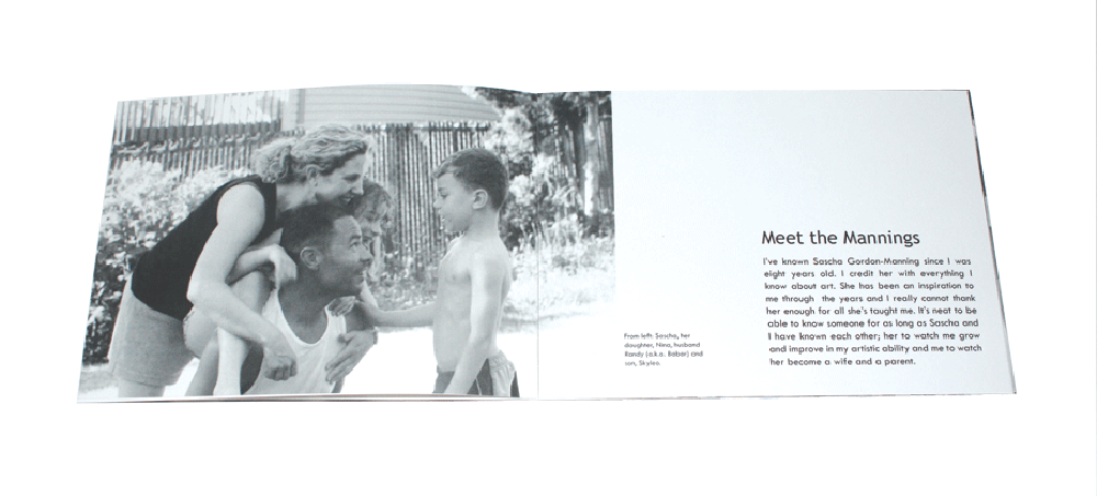
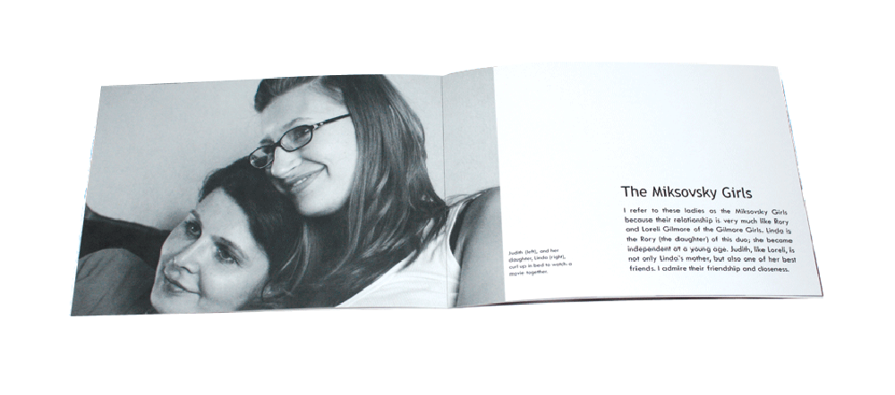
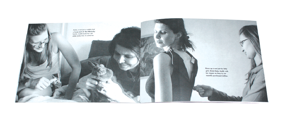
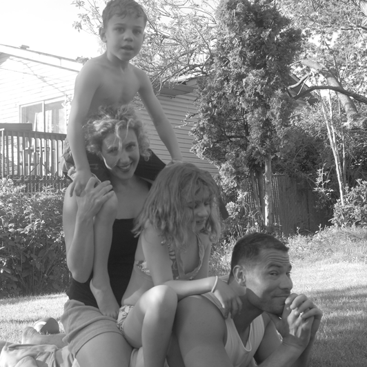
In addition to promoting my typographic skills, photography is also part of my repertoire. Intended to be a collector's item, this special edition photography book displays the beauty of diversity in families. The small size gives it a personal, pocket-sized family photo album feel. People are more apt to remember something with sentimental value or with a resonating connection.
Book front, 6" x 4.25"
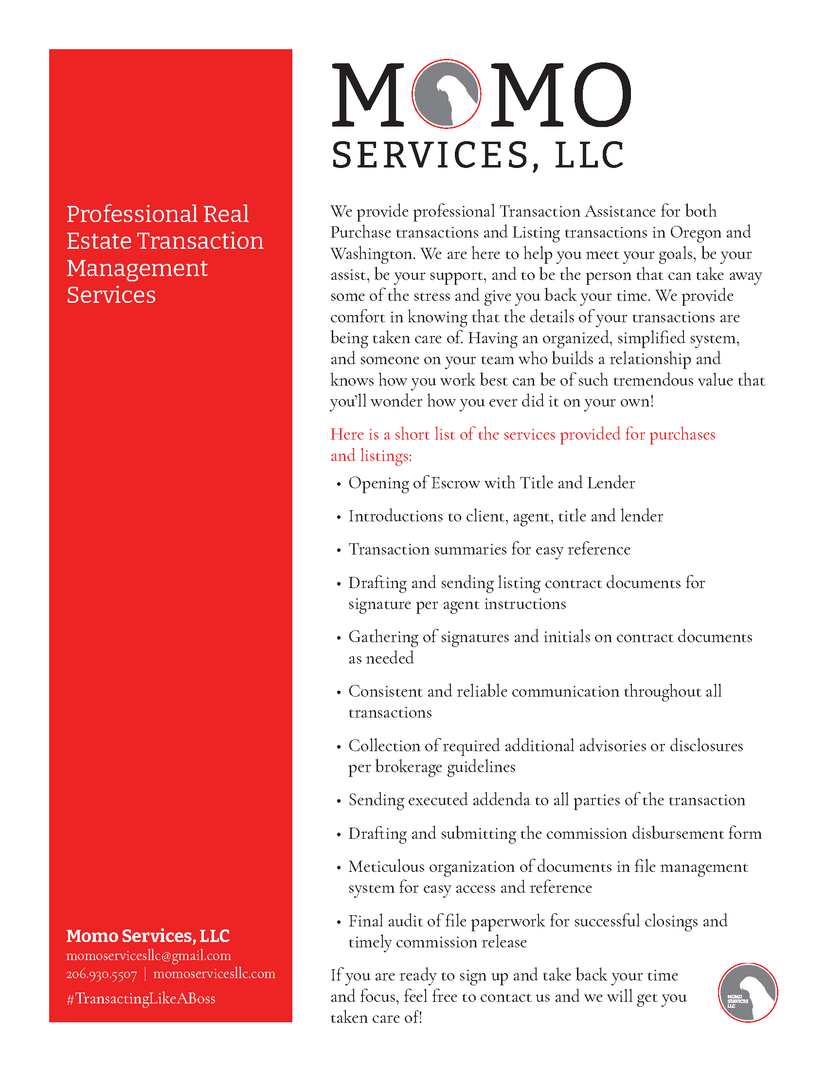
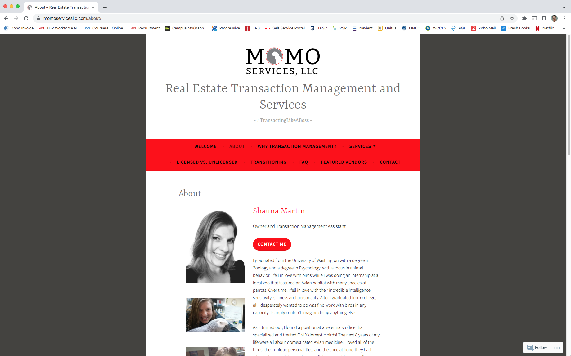
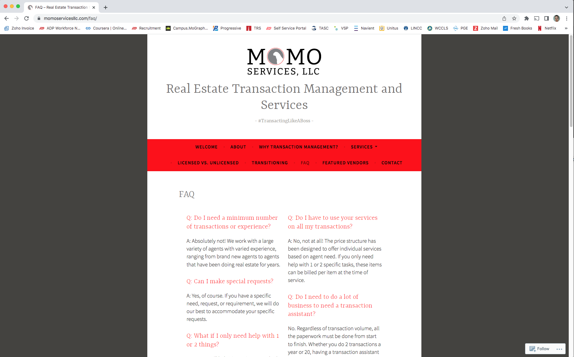
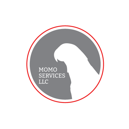
Momo Services LLC, a real estate transaction management company, needed full branding. The founder asked for a specific color palette and that an African gray parrot be included in the logo. The company was named after her beloved pet bird, Momo. With those perimeters in mind, I created a primary and secondary logo that looked professional. I applied the logo to their website and subsequent marketing materials such as flyers and informational sheets.
Primary logo
Secondary logo
Marketing flyer 8.5” x 11”
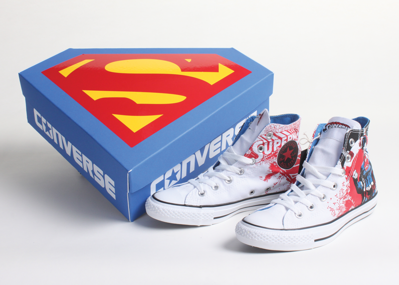
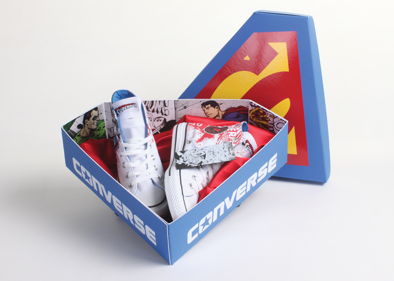
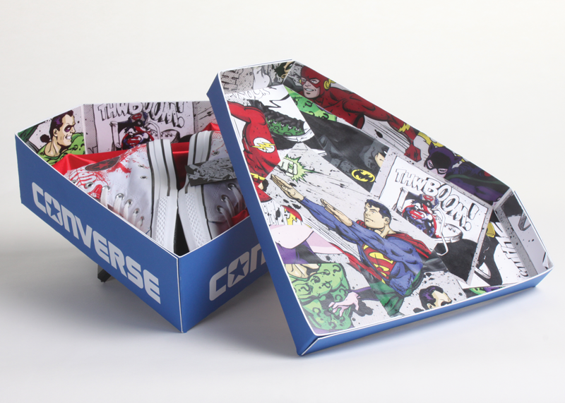
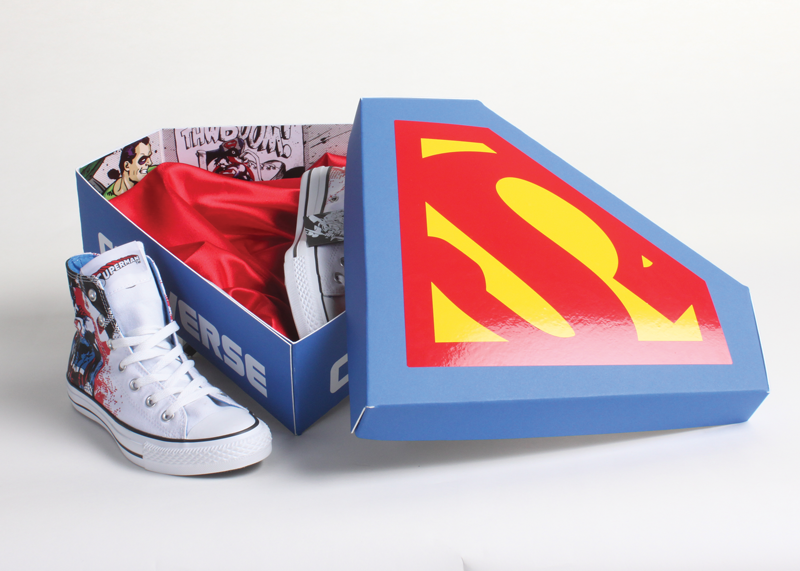
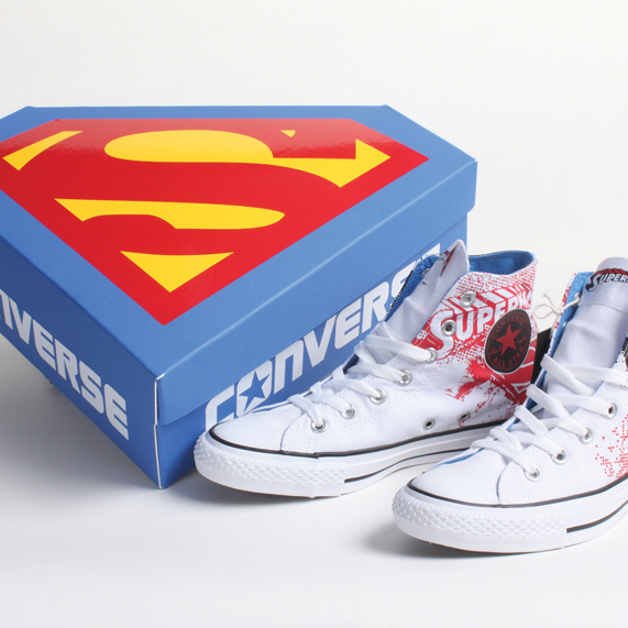
Converse has paired up with DC Comics to make a series of special edition superhero Chuck Taylors. They, in turn, are in need of special edition boxes (Superman in this case) worthy of the one-of-a-kind shoes. The only way to make a unique box is to make it iconic; achieved by utilizing Superman's logo complete with red cape and comic book lining. Consumers of Converse and Superman memorabilia alike will be intrigued and inclined to hold onto the box as a keepsake.
This is a fictional portfolio piece based on an actual shoe design, inspired by the designer.